Introduction
https://www.google.com/search?q=starbucks+logo+2018&sa=X&biw=1904&bih=906&tbm=isch&source=iu&ictx=1&fir=-D77BH-0-SCErM%253A%252CLY0TgIpsX1bqNM%252C_&usg=__AGhcfXFYXAS1ZUZyDL5WCneTOQs%3D&ved=0ahUKEwiYyeqM2-XaAhVS-2MKHfq2BH4Q9QEIKzAA#imgrc=CrHD9QMquGZzCM:
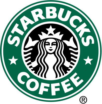
The logo was first designed by the founders of Starbucks. The logo was meant to be of a siren from Greek
mythology. Sirens would lure away sailors so shipwreck off the coast of an island. The thought was that the
logo would lure coffee lovers from all over to come and enjoy the coffee.
CONTRAST
![]()
The designer used contrast by making sure that the text and design were easy to ready and see against the
green backdrop. Using completely different colors allows the viewers to see view the text and design without too
much effort.
ALIGNMENT
![]()
The designer aligned the stars in the logo to give balance to design. The stars being aligned creates order within the logo that wouldn’t be there without them. If you were to imagine the Starbucks logo without the stars, it would appear to be misaligned. This is due to the length of each word being dramatically different. The alignment of the stars helps bring balance to the logo and therefore makes it more appealing.
REPETITION
![]()
The designer repeats the use of stars within the logo. This is to enhance and keep your eyes engaged to the logo. It is also used to eliminate white space. The repetition also helps to show the importance of the heritage of the logo. They represent an old nautical story from Greek mythology about sailors being lured away.
PROXIMITY
![]()
The text is a good example of proximity used by the designer. The designer made sure that text was the larger than everything else on the logo so that you could clearly seen the name of the company. Even though it is the only text on the page, the proximity of the words to each other ensures that the viewer can identify the name of the company easily.
COLOR
![]()
The use of color was great in the logo. The tones within the logo are very different. That in turns makes the logo easy to read and pleasing to the eye. When the colors are too dark, it is hard to read the text but the designer knew what they were doing when designing this logo. It was also a good idea to pick the color white to go with the dark green. White is easy to see and looks much more professional than if this was a different color.
CONCLUSION
The 5 principles outlined contribute to the overall design of the Starbucks logo by actually making it known around the world. The logo is recognizable anywhere in the world. The simplicity and keen eye for the small details in each of the categories outlined strategically draws the attention of its viewers.
