Introduction
It doesn’t get much more American then coke and I love it. I know we already did a section on logos but this design is so recognizable by so many people I couldn’t pass it up! The design was created by Frank Mason Robinson back in 1885. It was back then that he created the look for the cursive within the logo.
First Typeface
![]()
The first typeface used appears to be a sans serif type face. It is identified by because there are no serifs or strokes anywhere within the font. It is all uniform and mono weight. There are also no thick to thin transitions which also make it easy to identify.
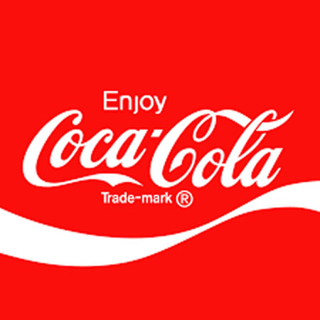
Second Typeface
![]()
The second typeface within the design is script. It is cursive and is easily identified due to its appearance of being hand printed. It looks like someone hand wrote coca-cola and you can see that like all scripts, it is not all capital letters. It is also visually appealing because it is larger grabs the attention of everyone.
Contrasts
There is such a drastic difference between the two typefaces. One has no appearance of strokes while the other is full of them. One appear to be created by hand while the other looks like it was created by a machine in order to be perfect.
Conclusion
I believe that the contrasts make this a very recognizable design but also bring a deepness to the logo that many overlook. The sans serif typeface to me symbolizes that everyone will enjoy it. It is perfect and attracts everyone. The script typeface makes you feel at home and that what you are about to experience has a familiarity to it and you begin to look have an emotional connection to it.
